The user interface of MobileUI consists of three main components:
- Viewports
- Pages
- Panels
ViewPorts
A viewport represents a rectangular region of the device screen in which the pages and panels are displayed, typically with some animation effect.
In the following scheme-figure 1 and 2 it's presented a Viewport -blue borders- which is showing the "Page1" page and the next action will be change you to the "Page 2" page with 'SLIDE_LEFT "effect. Note that the App may have other pages - "Page 3", "Page 4", etc., in any order, which are outside the Viewport and therefore not visible and out of the action. They might even have pages that don't exist yet and will be created then dynamically.
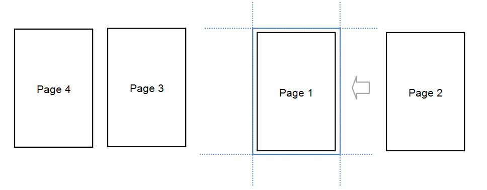 Figure 1
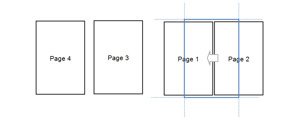
Figure 2
A Viewport is simply defined as a DIV with "mui-viewport" class and an id for your name, as shown below.
<div id=’<Nombre o Id del Viewport>’ class=’mui-viewport’>
…
…
</div>
Pages
The pages are the place where the presentation of information and interaction with the user, forms, animations, etc are developed.
The pages are always inside a Viewport and take 100% of it's size. There is only one visible page at a time on a Viewport.
A page is defined as a DIV with "mui-page" class and an id that represents it's name:
<div id=’<id de la página>’ class=’mui-page’>
…
…
</div>
Inside the DIV may have any static or dynamic HTML.
By convention, but not mandatory, usually we include on each page header and a body, but as we shall see, this is not always necessarily so. For these cases we use:
<div id=’<nombre de la página>’ class=’mui-page’>
<div class="mui-page-header">…</div>
<div class="mui-page-body [mui-scrollable]">
…
…
</div>
</div>
The optional class "miui-scrollable" indicates whether the body of the page will or will not scroll. It's a very important definition. See below for the special section Scroll.
Example
In the case of Figure 1 and 2, the code would be:
<div id=’mui-viewport’ class=’mui-viewport’>
<div id=Page1’ class=’mui-page’>
<div class="mui-page-header">…</div>
<div class="mui-page-body [mui-scrollable]">…</div>
</div>
<div id=’Page2’ class=’mui-page’>
<div class="mui-page-header">…</div>
<div class="mui-page-body [mui-scrollable]">…</div>
</div>
<div id=’Page3’ class=’mui-page’>
<div class="mui-page-header">…</div>
<div class="mui-page-body [mui-scrollable]">…</div>
</div>
<div id=’Page4’ class=’mui-page’>
<div class="mui-page-header">…</div>
<div class="mui-page-body [mui-scrollable]">…</div>
</div>
</div>
Panels
Panels, complement the pages in the model of user interaction, going in and out of the scene while their are visible. Unlike pages, don't have to take the total of the Viewport, they can float on the visible page, push it partially, etc.
Like pages, only one panel can be active at a time in a Viewport.
The following figure shows a typical example of a panel that pushes the current page while displaying:
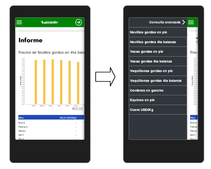 Figure 3
A panel is defined as a DIV with "mui-panel" class and an id that represents it's name:
<div id=’<id del panel>’ class=’mui-panel’>
…
…
</div>
Like pages, panels also may optionally have header and body:
<div id=’<id del panel>’ class=’mui-panel’>
<div class="mui-panel-header">…</div>
<div class="mui-panel-body [mui-scrollable]">
…
</div>
</div>
MobileUI App structure (Important)
MobileUI defined in it standard scheme two default Viewports, one base, called "mui-screen", which occupies the entire screen of the device and other major, called "mui-viewport", in which, typically, are deployed pages where the action is and may or may not fill the entire screen depending on the App design.
Thus an App would look like this:
<div id="mui-screen" class="mui-viewport">
<div id="mui-screen-page" class="mui-page">
<div id=’mui-viewport’ class=’mui-viewport’>
<div id=page1’ class=’mui-page’>
<div class="mui-page-header">…</div>
<div class="mui-page-body [mui-scrollable]">
…
</div>
</div>
<div id=’page2’ class=’mui-page’>
<div class="mui-page-header">…</div>
<div class="mui-page-body [mui-scrollable]">
…
</div>
</div>
</div>
</div>
<div id=’panel1’ class=’mui-panel’>
…
</div>
</div>
Note that the viewport called mui-screen contains a screen-page page which at the same time have a viewport inside, mui-viewport, which has the pages page1 and page2.
Note also that the panel is located at the level of mui-sceen, to obtain the Figure 3 example effect.
¿Why two Viewports?
The reason is simply statistical, Apps generally require at least two viewports and MobileUI seeks to propose a faster model.
We are going to apply it with an example using the two viewports. Notice the difference between the following interfaces:
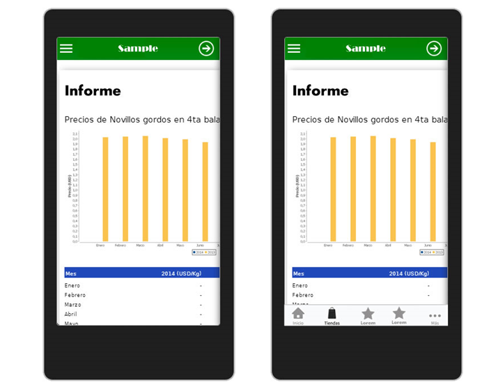
Figure 4
On the left figure, the interaction fills the entire screen, that is to say, when we change the page, the entire screen will change. In this case mui-viewport and mui-screen will be the same size (in this case the action will continue in mui-viewport and mui-screen and will only be to comply with the standard).
The App of the right, however, at the bottom has a fixed bar, so that the action will be in the higher portion of the screen, as presented in the next figure:
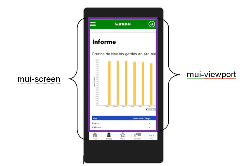
Figura 5
In this case the code of the App will remain with the blue aggregate:
<div id="mui-screen" class="mui-viewport">
<div id="mui-screen-page" class="mui-page">
<div id=’mui-viewport’ class=’mui-viewport’>
<div id=Page1’ class=’mui-page’>
<div class="mui-page-header">…</div>
<div class="mui-page-body [mui-scrollable]">
…
</div>
</div>
<div id=’Page2’ class=’mui-page’>
<div class="mui-page-header">…</div>
<div class="mui-page-body [mui-scrollable]">
…
</div>
</div>
<div id=’Panel1’ class=’mui-panel’>
…
</div>
</div>
<div class="mui-tabbar" id="tabbar">
…
</div>
</div>
</div>
Could the App have more than one Viewport?
Of course, you can create as many viewports as needed.
To do this would be enough to add:
<div id="myviewport" class="mui-viewport"> … </div>
and then start it with the API:
mui.createViewport(“myviewport”);